Symmetrical vs Asymmetrical Gallery Walls: A Practical Guide
Table of Contents
- Symmetrical vs Asymmetrical Gallery Wall Layouts: What's the Difference
- Gallery Wall Layout Ideas for Every Room and Style
- How to Plan a Gallery Wall: Choosing Frame Sizes and Shapes
- Gallery Wall Spacing and Measurements: Creating Visual Balance
- How to Arrange Art on a Wall: Step-by-Step Installation
- Common Gallery Wall Mistakes to Avoid
- Choosing the Right Layout for Your Space and Artwork
- Frequently Asked Questions
Last Updated: October 12, 2026
Symmetrical vs Asymmetrical Gallery Wall Layouts: What's the Difference
A gallery wall layout is the intentional arrangement of framed art, prints, or photos on a wall to create a cohesive visual composition. The two most common approaches are symmetrical and asymmetrical arrangements, each offering distinct aesthetic and practical benefits.
Symmetrical layouts create order and calm. Asymmetrical layouts bring movement and personality. The choice depends on your room, your art, and the mood you want to create. We'll walk you through both approaches so you can choose what works best for your space.
Symmetrical Layouts: Order and Visual Calm
Symmetrical gallery wall layouts mirror themselves along a central axis. One side matches the other. This creates a sense of balance and formality that many find soothing.
Symmetrical arrangements work well in traditional spaces. They also suit minimalist interiors where clean lines matter.
The strength of symmetry is visual predictability. Your eye knows where to look. There's no visual tension or surprise. For bedrooms, formal living rooms, or office spaces, this restraint feels intentional and professional.
The trade-off is that symmetrical layouts can feel static. If you have varied artwork in different sizes and styles, forcing them into a symmetrical pattern may feel forced.
Asymmetrical Layouts: Movement and Personality
Asymmetrical gallery wall layouts don't mirror themselves. The arrangement is unbalanced in position but balanced in visual weight. One side might have larger frames, the other side more frames of smaller size.
Asymmetrical layouts work with real collections. You don't need to buy matching frames. You can mix sizes, colors, and styles.
The visual effect is dynamic. Asymmetrical arrangements draw the eye on a journey across the wall rather than settling on a center point.
The challenge is achieving balance without symmetry. Visual weight matters more than physical placement.
Gallery Wall Layout Ideas for Every Room and Style
Grid and Centered Arrangements
Grid layouts use uniform spacing and frame sizes to create order. All frames are the same dimensions. Spacing between frames stays consistent, typically 1 to 3 inches apart.
Grid layouts suit contemporary spaces. They work in offices, bedrooms, and kitchens. Grid arrangements also work well for collections of similar artwork, a series of prints, family photos, or matching art sets.

Centered arrangements place a focal point in the middle, with other frames radiating outward in balanced fashion. This approach works well above a sofa, fireplace, or bed.
Both grid and centered approaches are symmetrical by nature. They require planning and precise measurement.
Salon-Style and Organic Arrangements
Salon-style layouts pack frames closely together with varied sizes and orientations. Frames may be tilted at slight angles. Spacing is tighter, sometimes just half an inch between frames.
Salon-style works when you have many pieces you want to display. It suits eclectic art collections and creative spaces.
Organic arrangements follow no preset pattern. Frames are placed intuitively based on size, color, and visual balance rather than measurement. This approach feels natural and personal.
Both salon and organic styles are asymmetrical. They require stepping back frequently to assess balance as you hang. Don't overthink placement, trust your eye and adjust as you go.
Hybrid Layouts: Blending Symmetry and Asymmetry
Hybrid layouts combine symmetrical and asymmetrical elements. You might create a symmetrical anchor, two matching frames flanking a central point, then add asymmetrical pieces around it. Or you might build a grid in one section and transition to a salon-style cluster elsewhere.
Hybrid approaches offer flexibility. They let you honor both order and personality. This works especially well in larger spaces where you can dedicate different wall zones to different layout styles.
The key to hybrid layouts is intentional transition. Don't scatter symmetrical and asymmetrical pieces randomly. Group similar layouts together, then shift to a different style in another zone. This creates visual coherence even as you mix approaches.
How to Plan a Gallery Wall: Choosing Frame Sizes and Shapes
Frame size and shape set the tone for your entire gallery wall layout. Consistent frames create order. Mixed frames create interest.
For symmetrical layouts, stick with one frame size or a limited range. Identical frames in black, white, or natural wood create clean symmetry.
For asymmetrical layouts, mixing frame sizes is encouraged. Combine large statement frames with clusters of smaller ones. Pair square frames with rectangular ones.
Shape matters too. All horizontal frames feel calm. All vertical frames feel formal. Mixing orientations adds movement. Mixing shapes, squares, rectangles, circles, creates visual richness.
Consider your artwork first. Do you have prints of similar size? Do your pieces vary widely?
Gallery Wall Spacing and Measurements: Creating Visual Balance
Proper spacing transforms a collection of frames into a cohesive gallery wall layout. Poor spacing makes even beautiful art feel chaotic.
Standard Spacing Guidelines
The standard spacing between frames is 1 to 3 inches. Tighter spacing (half inch to 1 inch) creates a salon-style, gallery-like feel.
Measure the space between frame edges, not the wall behind them. Use a ruler or measuring tape. Mark your spacing with painter's tape or light pencil marks before you hang.
Consistent spacing is more important than the exact distance. If all gaps are the same size, the arrangement feels intentional. Varying gaps randomly makes the layout feel accidental.
For vertical spacing, the same rule applies. Keep gaps consistent from top to bottom. This creates visual rhythm and guides the eye smoothly across the wall.
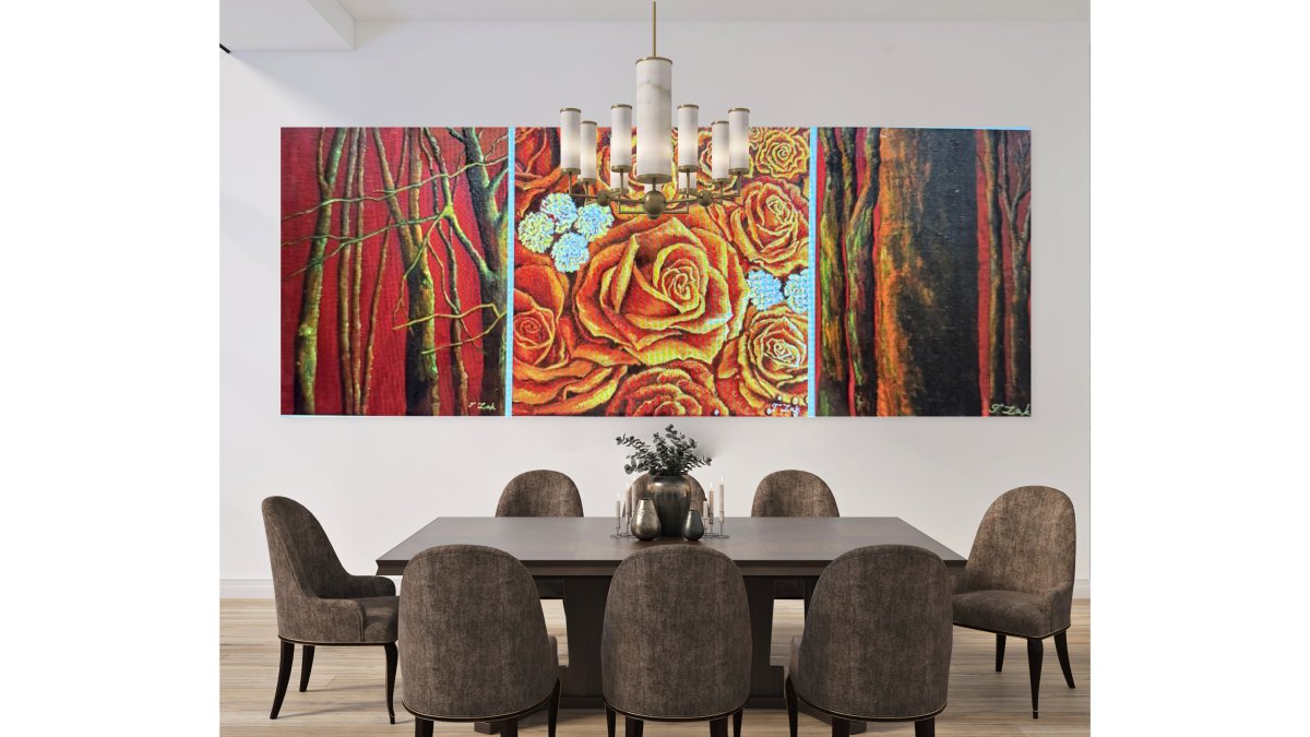
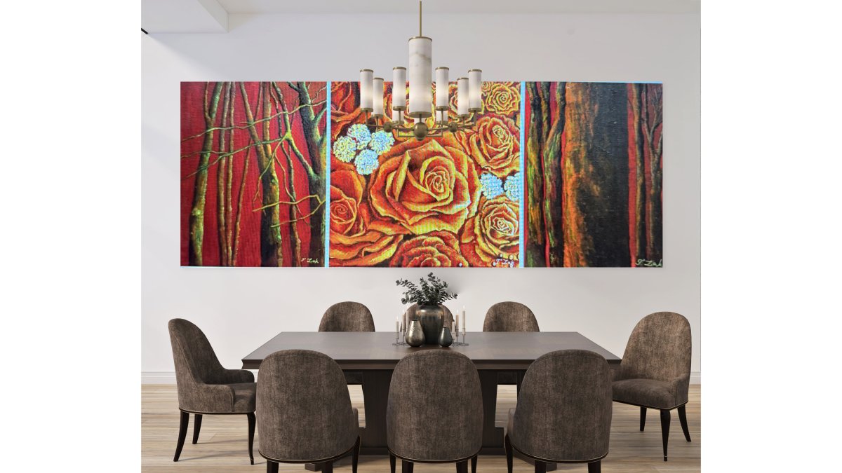
Set of 3 Canvases- Roses and Trees →
Balancing Asymmetrical Layouts with Negative Space
Negative space is the empty wall around your frames. In asymmetrical layouts, negative space is an active design element. It balances visual weight.
A large, bold piece needs more negative space around it than a small, subtle piece. A cluster of small frames on one side needs breathing room. Leave empty wall visible, don't fill every inch.
Step back frequently as you hang. Squint at the arrangement from across the room. Does one side feel heavier? Add negative space to the heavy side. Does the layout feel scattered? Tighten the groupings.
| Layout Type | Typical Spacing | Frame Consistency | Best For |
|---|---|---|---|
| Grid | 1-2 inches | All same size | Modern, minimal spaces |
| Centered | 1-3 inches | Varied sizes | Focal points above furniture |
| Salon-style | Half inch-1 inch | Mixed sizes | Gallery-like, curated feel |
| Organic | Variable | Varied sizes | Evolving collections |
How to Arrange Art on a Wall: Step-by-Step Installation
Measure and Mark Your Layout
Start on the floor. Lay out all your frames in your planned arrangement. Take a photo. This is your reference.
Measure the total width and height of your layout. Find the center point of your wall. Mark it lightly with a pencil. Work outward from the center in both directions.
Use painter's tape to outline where each frame will hang. Create a full-scale template on the wall. Step back. Does it look right? Adjust tape positions until you're satisfied.
Mark the nail hole position for each frame. Use a level to ensure frames hang straight. Double-check measurements before you drive any nails.
Hang and Adjust
Hang your frames starting from the center and working outward. Hang one side, then the other, to maintain balance.
Frames rarely hang perfectly on the first try. Be prepared to adjust. Nail holes in drywall are forgiving. You can move frames slightly and fill old holes later.
Check that frames are level. Use a level tool, not your eye. Crooked frames disrupt the entire layout, especially in symmetrical arrangements.
Stand back at least 6 feet from the wall to assess the full composition. The arrangement should look intentional and balanced from this distance. Details matter less than overall balance.
Common Gallery Wall Mistakes to Avoid
Spacing that's inconsistent. Varying gaps between frames make the layout feel accidental. Measure and maintain consistent spacing.
Frames that hang crooked. One tilted frame throws off the entire arrangement. Use a level for every frame.
Starting too high. Many people hang frames too high on the wall.
Choosing frames that don't match your space. Ornate gold frames in a minimalist room feel out of place.
Mixing too many styles. A few different frame styles create interest. Too many styles create chaos.
Forgetting about the furniture below. Your layout should relate to what's beneath it. Center your arrangement above a sofa, bed, or console table.
Choosing the Right Layout for Your Space and Artwork
Room Size and Wall Dimensions
Small rooms suit smaller, tighter layouts. A grid of 4-6 frames works well. Salon-style arrangements also suit small spaces because they create visual richness without taking up much wall area.
Large rooms and large walls can handle bigger, more expansive layouts. Grids of 9-16 frames work well. Organic arrangements that sprawl across the wall suit spacious living rooms and hallways.
Consider the wall's proportions. A tall, narrow wall suits vertical arrangements. A wide wall suits horizontal or sprawling layouts. Match your arrangement to the wall's natural shape.
Artwork Style and Personal Aesthetic
Your artwork should guide your layout choice. If your pieces are all similar in style, size, and color, symmetrical layouts feel natural. If your pieces vary widely, asymmetrical layouts let each piece shine.
Formal artwork, fine art prints, classical pieces, suits symmetrical or centered layouts. Eclectic artwork, mixed media, photography, varied styles, suits salon-style or organic arrangements.
Your personal taste matters most. Do you prefer order and calm? Choose symmetrical. Do you prefer personality and movement? Choose asymmetrical. The best layout is one that feels true to how you see your space.
Focal Points and Furniture Placement
Arrange your gallery wall layouts to complement existing focal points. Center layouts above a sofa, bed, fireplace, or console table. Let the furniture anchor the arrangement.
In hallways, let the layout stretch along the wall. In stairwells, follow the line of the stairs. In corners, create a clustered arrangement that fills the corner without overwhelming it.
Consider sight lines. What do you see when you enter the room? Place your most striking pieces where they'll be noticed first. Build the arrangement around these anchor pieces.
Creating a gallery wall layout that works for your space takes planning and intention.
At Tatyana Zak, we create hand-embellished art pieces designed to anchor gallery walls and inspire personal connection. Our limited-edition prints, including collections like the Set of 3 Canvases in Roses and Trees, work beautifully in both symmetrical and asymmetrical arrangements. Explore our curated art sets and discover how meaningful artwork transforms your space into something uniquely yours.
Frequently Asked Questions
What's the best way to arrange a gallery wall?
The best approach depends on your space and personal style. Start by choosing a layout, symmetrical for calm, orderly appeal or asymmetrical for dynamic, organic feel. Measure your wall, plan your arrangement on paper first, mark frame positions lightly with pencil, and use a level to ensure straight placement. Maintain consistent 1-3 inch spacing between frames. Test your layout with paper cutouts before hanging anything permanent.
How much space should you leave between frames in a gallery wall?
Standard spacing is 1-3 inches between frames for a cohesive look. Symmetrical layouts typically use uniform spacing throughout, while asymmetrical arrangements can vary spacing to create visual rhythm. Consistent spacing prevents the wall from feeling chaotic and helps frames read as a unified composition rather than scattered pieces.
Should gallery wall frames be the same size?
Not necessarily. Symmetrical layouts often use identical or matching frame sizes for visual order, while asymmetrical galleries benefit from mixed sizes to create dynamic balance and visual interest. Mixing frame sizes works well in salon-style arrangements. The key is intentional composition, choose sizes that complement your artwork and create visual harmony across the wall.
How do you make an asymmetrical gallery wall look balanced?
Balance asymmetrical layouts by distributing visual weight across the wall. Larger or darker pieces should be offset by lighter or smaller ones positioned elsewhere. Use negative space strategically, don't cluster all art on one side. Consider the overall composition as a whole rather than individual frames. Thoughtful spacing and varied frame sizes help create equilibrium even when the arrangement isn't perfectly symmetrical.