Contemporary Art for Calming Home Spaces
Table of Contents
- Why Contemporary Art Belongs in Calming Home Spaces
- How to Choose Calming Wall Art
- Calming Abstract Art: Expressive Brushstrokes Without the Noise
- Contemporary Nature Wall Art and Biophilic Design
- Choosing Modern Art for Living Room Calm
- Scale, Placement, and Hanging Height That Keep a Room Serene
- Lighting, Materials, Framing, and Care for Lasting Calm
- Conclusion
- Frequently Asked Questions
Last Updated: October 12, 2026
Why Contemporary Art Belongs in Calming Home Spaces
A quiet room is not the same as a calm one. You can paint the walls soft grey, add a linen sofa, and still feel wired at the end of the day. The usual culprit is the art on the wall. This guide from Tatyana Zak covers how to choose contemporary art for calming home spaces, from muted palettes to hanging height.
What Visual Calm Actually Means
Visual calm is the state a room creates when nothing on the wall competes for your attention faster than you choose to give it. A calm space lets your eye rest, then wander, then rest again.
Three things produce it:
- Low contrast at the edges. Soft transitions between tones instead of hard jumps.
- One clear focal point. Not five pieces fighting for the same wall.
- Breathing room. Empty wall space is part of the composition, not wasted space.
According to the American Psychological Association's resources on environment and stress, surroundings that reduce visual stimulus help lower the load on attention. That is the mechanism behind a peaceful home.
How to Choose Calming Wall Art
Start with the palette, then the subject, then the size. Most people reverse that order and end up with a beautiful piece that overwhelms the room.
A Practical Selection Framework
Use this four-step filter before you buy anything:
| Step | Question to Ask | What to Look For |
|---|---|---|
| 1. Palette | Does it repeat 2-3 tones already in the room? | Muted palette, calming neutrals |
| 2. Contrast | Is there one focal point, not several? | Single area of visual interest |
| 3. Subject | Does it suggest space, horizon, or stillness? | Abstract landscape, seascape, nature art |
| 4. Scale | Will it occupy 60-75% of the wall width above furniture? | Proportion to the sofa or bed |
A common mistake is buying art too small for the wall, small pieces on a large wall create visual clutter, the opposite of calm.
Calming Abstract Art: Expressive Brushstrokes Without the Noise
Calming abstract art gives the eye movement without demanding interpretation. Expressive brushstrokes read as energy, but inside a restrained palette that energy stays gentle, if you know which variables control it.
The Four Variables That Decide Whether an Abstract Reads Calm or Loud
Most shoppers judge abstract art by color alone, but four variables interact, and any one can flip a piece from restful to restless:
- Value contrast. The gap between the lightest and darkest tones. A piece with soft mid-tones and no true black reads calmer than one with the same palette but a single hard dark stroke.
- Edge quality. Soft, blended edges let the eye glide. Hard, crisp edges create stops. A painting can be 90% soft-edged and still feel activated by one sharp line.
- Stroke density. How much of the surface is covered by visible marks. Sparse, breathing compositions feel quieter than all-over, densely worked fields, even at identical saturation.
A useful exercise: squint at a piece from across the room. Squinting removes detail and leaves only value and mass. A soft, low-contrast shape will settle a room; a checkerboard will not.
Matching Abstract Art to Your Own Visual Sensitivity
Calm is not universal. Two people can stand before the same canvas and one feels soothed while the other feels agitated. Most buying guides skip this, yet it matters more than any palette rule.
A few patterns worth knowing about yourself before you buy:
- If you notice pattern and repetition quickly, high-frequency repeating marks (dense dots, tight grids, uniform dashes) may feel busy even in muted colors. Favor irregular, organic gesture.
- If you are sensitive to contrast, avoid pieces with a single high-contrast focal mark, even if the rest is soft. The eye keeps returning to it.
- If you prefer a sense of depth, look for layered, multi-tonal surfaces where one color sits visibly over another. Flat blocks of color read as graphic rather than atmospheric.
There is no wrong answer, only a mismatch between the piece and the person living with it. A calm room is a personal calibration, not a formula.
A Quick Test Before You Commit
Before buying an abstract, try this:
- View the piece at the size it will actually hang. A 12" x 12" print and a 36" x 36" canvas of the same image have very different visual weight.
- Look at it for a full minute without looking away. If your eye keeps jumping to the same spot, that spot will keep pulling attention on your wall.
- Check it in the light you actually have. Cool daylight and warm evening bulbs shift how blues, greys, and earth tones read.
This is where hand-embellished work earns its place. In our collection, each piece is individually hand-enhanced with acrylic paint, so the surface has real depth a flat print cannot reproduce, no two are identical, and the texture is part of what you are choosing.
Contemporary Nature Wall Art and Biophilic Design
Contemporary nature wall art borrows the calm of the outdoors and brings it inside.
You do not need a literal forest photograph. An abstract landscape or a horizon line does the work.
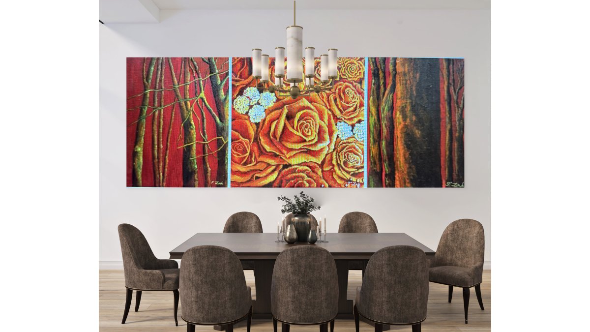
Our Set of 3 Canvases - Roses and Trees is a good example.

U.S. Environmental Protection Agency guidance on indoor environments notes that interior conditions shape how people feel and function day to day.
Set of 3 Canvases- Roses and Trees →
Choosing Modern Art for Living Room Calm
Modern art for living room walls should anchor the space, not decorate it. The living room carries the most visual traffic of any room, so it needs a focal point strong enough to organize everything around it, and calm enough to live with for years.
Balancing Visual Energy with Restful Areas
Think of the wall as zones: one holds the focal piece, the rest holds quiet.
- Focal zone: the largest work, centered above the main seating
- Rest zones: open wall, or a single small piece with generous space around it
- Transition zone: a vertical or narrow piece near a doorway or corner
If every zone has something in it, the room has no rest. The fix is subtraction, not addition.
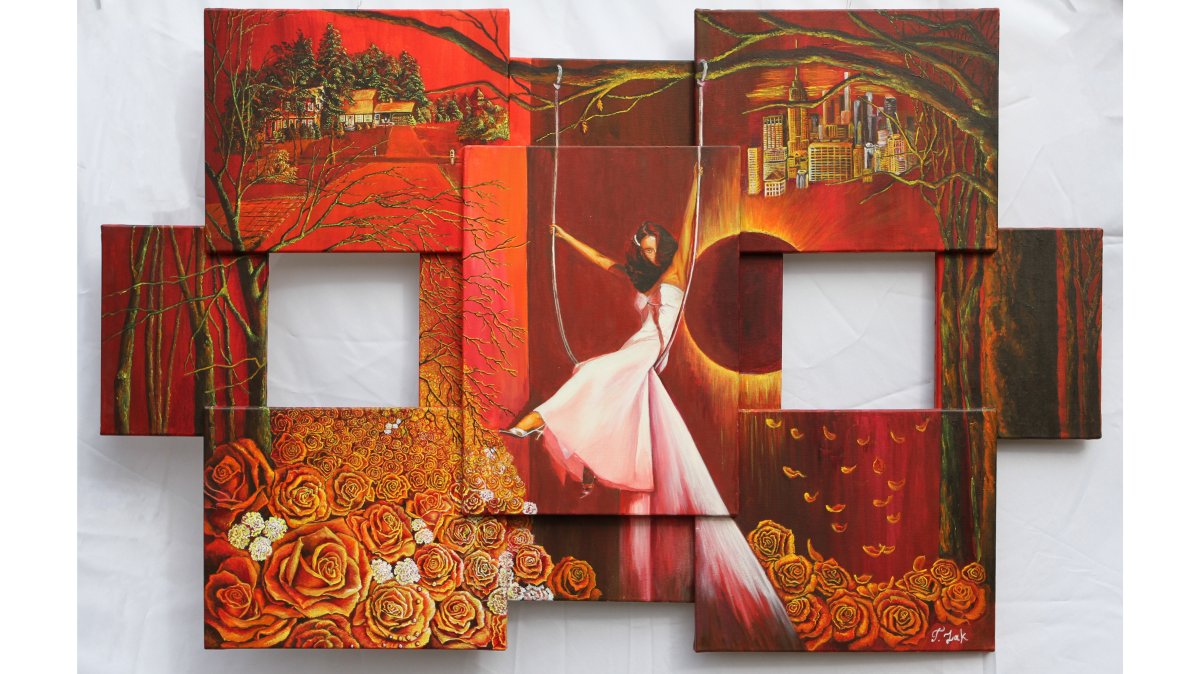
For larger living rooms, a multi-panel set can carry the focal zone while keeping individual panels visually light. A Four-Panel Journey in Balance uses four 16" x 16" canvases to build a rhythm across the wall, alternating stillness and movement, with each panel hand-enhanced by the artist.

Scale, Placement, and Hanging Height That Keep a Room Serene
Get scale and height right and almost any artwork feels calm; get them wrong and even a muted piece feels restless.
The standard rule: art should span 60 to 75 percent of the width of the furniture below it.
| Room | Typical Piece Size | Hanging Center Height |
|---|---|---|
| Above a sofa | 60-75% of sofa width | 57-60 inches |
| Above a bed | 60-75% of bed width | 57-60 inches |
| Hallway or narrow wall | Single vertical piece | 57-60 inches |
| Dining room | Centered over table | 57-60 inches |
For a Night Blues of the Suburbs canvas at 24" x 24", that means centering it above a console or smaller sofa rather than stretching it across a wide sectional.

Lighting, Materials, Framing, and Care for Lasting Calm
Lighting decides whether a calm piece stays calm. Direct, hard light creates glare and hot spots; diffused light, or light raking across the surface at an angle, reveals texture instead. But material and framing determine how the art responds to that light over years.
Lighting Rules That Actually Change How a Piece Reads
- Avoid hanging art directly opposite a window with strong afternoon sun. UV exposure fades pigments and yellows paper over time.
- Use warm-toned bulbs rather than cool white near the artwork. Cool white light pushes blues and greys toward a clinical feel; warm light softens them.
- Add a picture light only if it can be dimmed. A fixed bright picture light turns a calm piece into a spotlight.
Canvas vs. Paper vs. Panel: What the Material Changes
This comparison affects both budget and long-term calm.
- Gallery-wrapped canvas. No frame, no glass. The surface stays open, reflections are minimal, and texture is visible. Best for rooms with tricky light and for anyone who wants a low-maintenance hang. Canvas can be dusted dry and generally does not need glazing.
- Fine art paper, framed. Paper holds finer detail and deeper blacks than canvas, which can make a piece read as more graphic and higher-contrast. It almost always needs glazing, which introduces reflection unless you choose anti-reflective glass.
- Rigid panel (wood or aluminum). Very flat, very modern, no wrap edge. Excellent for minimalism, but the hard surface reflects more light and shows glare more readily than canvas.
For calm, canvas and matte-finish panels usually win on reflection control. For crisp detail, paper wins, but budget for anti-reflective glazing.
Framing Choices That Support a Calm Room
- Floater frames leave a visible gap between canvas edge and frame, which reads as intentional and modern.
- Thin, light-toned frames disappear into the wall and let the art carry the room.
- Heavy, ornate frames add visual weight and can fight a minimal palette.
Care That Protects Both the Surface and the Mood
Care is simple, but rules differ by material:
- Dust canvas with a dry, soft cloth. Never use a damp cloth on hand-embellished work, the acrylic detail sits on the surface, and moisture can dull or lift it.
- Keep all pieces out of prolonged direct sun. Even UV-coated prints fade over years of daily exposure.
- Avoid spraying cleaner onto any art surface. Spray the cloth, not the art, and only for glass or frame edges.
Our canvases ship ready to hang with mounting hardware included, and each hand-enhanced collector edition arrives signed, numbered, and with a Certificate of Authenticity. That documentation matters for care as much as value, it tells you exactly what surface you are maintaining.
Conclusion
Building a peaceful home is less about buying more and more about choosing better. The right contemporary art for calming home spaces does one job: it gives the eye a place to rest without going blank.
At Tatyana Zak, every piece is individually hand-enhanced with acrylic paint, signed and numbered, and released in limited editions so what you hang stays genuinely yours.
Browse the new arrivals and find the piece that holds your space.
Frequently Asked Questions
What are some calming art styles for a home?
Abstract landscapes, minimalist compositions, seascapes, and nature-inspired contemporary pieces tend to read as calming because they use soft tones, open space, and gentle repetition. Muted palettes in blues, greens, warm neutrals, and soft grays lower visual stimulation. Look for pieces with a clear horizon line or a single focal point rather than many competing details. Hand-embellished collector editions add subtle texture that catches light without adding busyness, which keeps a room feeling grounded instead of flat.
What is the 70/30 rule in art?
The 70/30 rule is a balance guideline: about 70 percent of a composition or a wall grouping stays quiet and restful, while 30 percent carries the visual energy. Applied to a room, that means most of your wall space and color stays in muted, calming territory, and one piece or one accent area holds the contrast. A red-dominant canvas set against a neutral room is a good example. It gives the eye something to land on without turning the whole space into a gallery of competing statements.
How do I choose wall art that makes a room feel calmer?
Start with the room's job. A bedroom wants softer contrast and lower saturation; a living room can handle a larger statement piece. Measure your wall, then pick art that covers roughly two-thirds to three-quarters of the width of the furniture below it. Hang the center of the artwork at about 57 to 60 inches from the floor. Then check the light: a piece that looks muted in daylight can turn heavy under a warm bulb, so view it in the room's actual lighting before committing.
Can nature-inspired art help create a more relaxing atmosphere?
Nature imagery supports biophilic design, which connects indoor spaces to natural elements. Trees, horizons, water, and botanical motifs give the eye familiar patterns to rest on, and that familiarity reads as safe rather than stimulating. Contemporary nature wall art works well here because it abstracts the landscape instead of documenting it, leaving room for personal interpretation. A three-canvas set of roses and trees, for example, brings that natural reference into a minimalist or modern interior without demanding attention.
Where should I hang calming art in my home?
Place it where you pause: above a sofa, opposite a bed, beside a reading chair, or in a hallway you walk slowly. In a meditation or zen space, keep the piece at seated eye level so you can look at it directly. Avoid hanging calming art in high-traffic spots facing a television or a bright window, since glare and competing light sources flatten the muted tones that make the work restful. One well-placed piece beats three scattered ones.