How to Display Art in Small Offices: A 2026 Guide
Table of Contents
- Step 1: Measure Your Space and Pick the Right Art Scale
- Step 2: Choose the Best Contemporary Art for Office Walls
- Step 3: How to Choose Office Wall Art for Productivity
- Step 4: Gallery Wall Layout Ideas for Small Spaces
- Step 5: Master Placement and Ergonomic Considerations
- Step 6: Rental-Friendly Hanging Solutions and Lighting
- Step 7: Budget-Friendly DIY Art Sourcing and Framing
- Frequently Asked Questions
Last Updated: September 29, 2026
Step 1: Measure Your Space and Pick the Right Art Scale
The fastest way to make a small office feel cramped is to display art that fights the room. Learning how to display art in small offices starts with one number: wall coverage. At Tatyana Zak, we hear the same worry from first-time buyers, and it usually comes down to scale. Get the size right and everything else falls into place.

The 70/30 Rule for Wall Coverage
Art should cover about 70% of the wall space above a piece of furniture, leaving 30% as breathing room. This keeps the visual weight balanced.
How to Test Scale Before You Hang
Try this before you spend a dollar:
- Cut paper to the exact size of the art you want
- Tape it to the wall with painter's tape
- Step back and check the scale and proportion
- Leave it up for a full day
You will spot problems fast. If the paper looks small, the art will look small.
Step 2: Choose the Best Contemporary Art for Office Walls
The best contemporary art for office walls does two jobs at once: it anchors the room and it gives you something worth looking at between tasks. That is a tall order for a small space, so pick pieces with depth.
Abstract Art as a Focal Point
Abstract work earns its place in small rooms. There are no fine details to squint at, so a single bold canvas can carry an entire wall.
Biophilic Design and Nature-Inspired Art
Biophilic design connects a space to nature. In a windowless office, nature-inspired art does that work for you.
Step 3: How to Choose Office Wall Art for Productivity
How to choose office wall art for productivity comes down to three variables you can actually control: palette, visual complexity, and where the piece sits in your field of view. Most guides stop at color. The placement half is where the real gains are, and almost no one covers it.
Color Psychology and Fatigue Reduction
Color psychology is not a gimmick, but it is also not magic. The practical version is this: your eyes refocus and reset every time they leave the screen. Whatever they land on either restores them or taxes them further.
| Work Type | Best Palette | Why It Helps |
|---|---|---|
| Deep focus | Blues, grays, greens | Calms the eye |
| Creative work | Warm reds, golds | Adds energy |
| Client-facing | Neutrals with one accent | Feels polished |
| Long screen hours | Muted tones | Reduces fatigue |
Visual Complexity: The 3-Second Reset Rule
A useful rule of thumb: if you cannot take in the whole piece in about three seconds, it is too busy for a wall you look at all day. High-detail art forces your eye to scan, which is the opposite of a rest. Low-detail art, broad shapes, soft gradients, single subjects, lets your gaze settle and release.
Ergonomic Placement: Where the Art Sits in Your Field of View
This is the part competitors skip. Office ergonomics apply to art the same way they apply to your monitor.
- Directly behind the monitor: worst spot. The art sits in your peripheral vision all day and pulls your gaze off-task. Skip it, or keep it extremely low-contrast.
- Beside the monitor, at seated eye level: best spot. Your eyes rest there during micro-breaks without your neck moving.
- On the wall behind you: useful only if you turn to think. Otherwise it does nothing.
- Above the monitor: creates a constant upward pull. Fine for a clock, bad for art.
Match Art to Task, Not Just Taste
If your office hosts video calls, remember the camera sees what is behind you. A busy gallery wall reads as visual noise on a small screen. A single calm piece reads as intentional. If you take most calls facing a wall, put your strongest piece there and keep the rest of the room simple.
Step 4: Gallery Wall Layout Ideas for Small Spaces
Gallery wall layout ideas for small spaces follow one rule: group, do not scatter. A tight cluster reads as one unit. Scattered frames chop the wall into clutter.
Coordinated Sets vs. Curated Collections
Coordinated sets share a palette and theme, so they always look intentional. A set like A Four-Panel Journey in Balance hangs as one immersive experience. Four 16" x 16" panels build a rhythm across the wall.
A Four-Panel Journey in Balance (16” X →

- Coordinated sets: fast, cohesive, low risk
- Curated collections: personal, slower to get right
- Mixed approach: one set plus a single accent piece
Step 5: Master Placement and Ergonomic Considerations
Placement is where most small offices go wrong. The art ends up too high, too low, or in the wrong sightline. Fix the height and the room changes.
The 57-Inch Rule and Eye-Level Placement
Museums hang art so the center sits about 57 inches from the floor. That is average eye-level for a standing adult. In an office, you sit for most of the day, so adjust.
Try this quick check:
- Center of art sits at seated eye level
- No glare from a window or lamp hits the surface
- Art is visible without turning your whole body
- Nothing blocks the view from your chair
Step 6: Rental-Friendly Hanging Solutions and Lighting
Renters face a real problem: no holes allowed. The good news is that damage-free options now hold real weight. You can hang a full gallery wall and still get your deposit back, if you match the hardware to the load and prep the surface correctly. This is the step most guides gloss over, and it is where renter setups fail.
Match the Hardware to the Weight
Adhesive strips and hooks are rated by weight, and the rating is per strip, not per frame. A common rule of thumb is to use two strips per pound of art, then add one extra strip for safety margin. A three-pound framed print gets at least seven strips by that math, most people use two and wonder why it falls.
- Adhesive strips: best for prints and lightweight frames. Check the package rating; the number on the box is the total, not per strip.
- Removable wall hangers (the hook-and-loop or wire-backed kind): good for medium frames and small canvases. Many are rated for several pounds each.
- Picture rail systems: no wall damage at all, and they let you swap art without re-hanging. Best if you have crown molding or a rail already installed.
- Freestanding easels and leaning: zero mounting required. Lean larger canvases against the wall on the floor or on a console. Works especially well in corners.
- Tension rods and over-door hangers: useful for lightweight pieces on the back of a door or in a closet-turned-office.
Lighting for Small Office Art
Lighting for small office art is the step everyone skips. A dim corner flattens even a strong piece. The goal is angled, soft light that reveals texture and depth without glare or fading.
Three practical options for a small office:
- Clip-on picture lights: the cheapest fix. Clip to the top of the frame and angle the beam down across the canvas at roughly 30 degrees. This angle rakes the light across the surface and shows texture instead of washing it out.
- Adjustable desk lamps: aim the head at the art, not at your face. A lamp with a matte shade and a warm-to-neutral bulb (around 2700K to 3000K) keeps the piece looking natural.
- Battery LED picture lights: no cord, no outlet, no wall damage. Ideal for renters. Most run for weeks on a charge.
Step 7: Budget-Friendly DIY Art Sourcing and Framing
You do not need a gallery budget to fill a small office. The trick is to spend where it shows and save where it does not.
Cheap routes that still look sharp:
- Print your own photos on canvas
- Buy open-edition prints and frame them well
- Hunt estate sales and local markets for originals
- Trade with local artists for a piece you love
Frequently Asked Questions
What is the 70/30 rule in art?
The 70/30 rule suggests that art should cover about 70% of the available wall space above a piece of furniture, while leaving 30% as negative space. In a small office, this prevents the room from feeling cramped. For example, if your desk is 48 inches wide, the art above it should span roughly 34 inches. This balance creates visual weight without overwhelming the space.
How do you hang art in a small office without making it feel cramped?
To display art in a small office without crowding, stick to one or two focal points rather than filling every wall. Use the 57-inch rule for eye-level placement, and choose pieces with lighter frames or canvas prints that blend with the wall color. A single large statement piece often works better than several small ones. Keep negative space around the art to let the room breathe.
Should I use a gallery wall or a single statement piece in a small office?
It depends on your wall space and visual goals. A single statement piece, like a 24" x 24" hand-enhanced print, anchors the room without adding visual clutter. A gallery wall works if you have a narrow vertical wall or want to showcase a coordinated set. For small offices, limit gallery walls to 3-5 pieces and keep spacing consistent (2-3 inches apart) to avoid a chaotic look.
How can art improve productivity in a small office?
Art can reduce mental fatigue and boost focus by giving your eyes a restful focal point. Research on color psychology suggests that cool tones like blue and green promote calm, while warm accents add energy. Placing art at eye level in your line of sight during breaks can support deep focus. Choosing pieces that reflect your personal values or memories also improves workspace morale and emotional clarity.
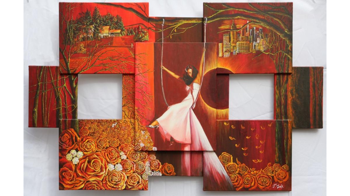
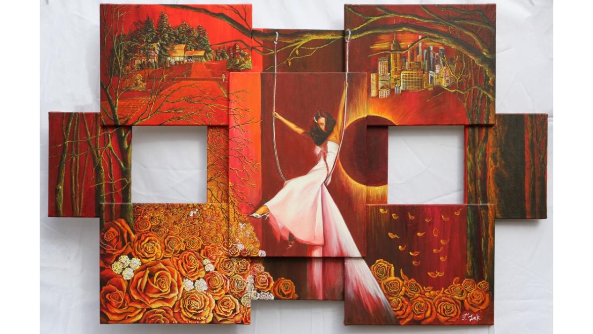
A small office does not have to feel plain. The right scale, palette, and placement turn a tight wall into a space that works for you. Tatyana Zak offers hand-embellished limited-edition prints and coordinated art sets, each one finished by hand so no two pieces are identical. Browse the Swing of Life Collection and shop new arrivals to find a piece that fits your space and your story.