How to Choose Meaningful Wall Art: A Complete Guide
Table of Contents
- Step 1: Define Your Emotional Connection and Personal Meaning
- Step 2: Assess Your Space and Determine the Right Scale and Size
- Step 3: Understand Color Palette and Visual Balance
- Step 4: Learn the Benefits of Hand-Embellished Art Over Mass-Produced Prints
- Step 5: How to Style a Gallery Wall with Cohesion and Composition
- Step 6: Apply Art Placement Rules for Interior Design
- Common Mistakes to Avoid When Selecting Wall Art
- Frequently Asked Questions
Last Updated: September 24, 2026
Step 1: Define Your Emotional Connection and Personal Meaning
When you choose meaningful wall art, you start by understanding what moves you. Before you browse galleries or scroll through collections, pause and ask yourself what draws you in emotionally. Meaningful art isn't about matching your sofa or filling blank wall space. It's about selecting pieces that speak to your inner life.

Consider what moments, themes, or feelings resonate with you right now. Are you drawn to nature? Do urban landscapes energize you? Does abstract work invite reflection? Your answer matters because the best wall art becomes part of your daily environment. You'll see it every morning and every evening. It should feel like it belongs to your story.
According to research on environmental psychology and well-being, the art surrounding us influences our mood, stress levels, and sense of belonging in our spaces. This isn't frivolous. The pieces you live with shape how you feel.
At Tatyana Zak, we believe meaningful art goes beyond aesthetics. Each piece should invite personal interpretation. Hand-embellished works, for instance, carry the artist's intention in every brushstroke. When you choose art with intention, you're not just decorating. You're curating an environment that reflects who you are and who you're becoming.
Step 2: Assess Your Space and Determine the Right Scale and Size
The right scale transforms a room. Too-small art on a large wall feels lost and diminishes the impact. Too-large pieces overwhelm intimate spaces and create visual tension. Scale and proportion are foundational to how wall art functions in your environment.
Start by measuring your wall. Note the dimensions and any architectural features like windows, doors, or built-in shelving. Then step back and observe the wall's relationship to furniture and traffic flow. A focal point wall, the first thing you see when entering the room, demands different sizing than a secondary wall.
For a single statement piece above a sofa or bed, a good rule is to choose art that's about two-thirds the width of the furniture beneath it. This creates visual balance without overwhelming the space. For smaller walls or intimate spaces, a 24" × 36" canvas works well. Larger living rooms can accommodate 36" × 48" or even bigger installations.
Gallery walls follow different logic. Multiple smaller pieces create rhythm and movement. When combining sizes, the largest piece should anchor the composition. Smaller pieces fill spaces and create visual interest around it.
Step 3: Understand Color Palette and Visual Balance
Color is the language of emotion in art. Your color palette sets the mood and determines how the art integrates with your space. Meaningful art works with your existing colors, not against them, unless you're intentionally making a bold statement.
Start by identifying your room's dominant colors. Neutral walls provide flexibility. Colored walls require more thoughtful art selection. If your walls are soft gray, warm whites, or muted tones, you have broad options. If your walls are bold, deep blue, forest green, or warm terracotta, your art should either complement or create intentional contrast.
Color theory teaches us that analogous colors (those near each other on the color wheel) create harmony. Complementary colors (opposite on the wheel) create energy and visual interest. Monochromatic schemes feel cohesive and calm. Understanding these relationships helps you choose art that enhances rather than competes with your space.
Consider also how natural and artificial light affects color. Morning light shifts how colors appear. Evening light warms or cools tones. Art that looks perfect in bright gallery light might feel different in your home's actual lighting conditions. If possible, test how pieces look at different times of day before committing.
Visual balance doesn't require symmetry. Asymmetrical arrangements feel more dynamic and contemporary. A large piece on one side can be balanced by clustered smaller pieces on the other. The key is distributing visual weight across the wall so no single area feels heavy or neglected.
Step 4: Learn the Benefits of Hand-Embellished Art Over Mass-Produced Prints
Hand-embellished art occupies a unique space between reproduction and original artwork. Each piece is touched by the artist's hand, making every version distinct. This matters more than you might think.
Mass-produced prints are consistent and affordable. They serve a purpose. But they lack presence. They're designed to be replaceable. Hand-embellished pieces, by contrast, carry intention. When an artist adds acrylic paint, texture, and personal marks to a print, they're creating something that exists nowhere else in the world.
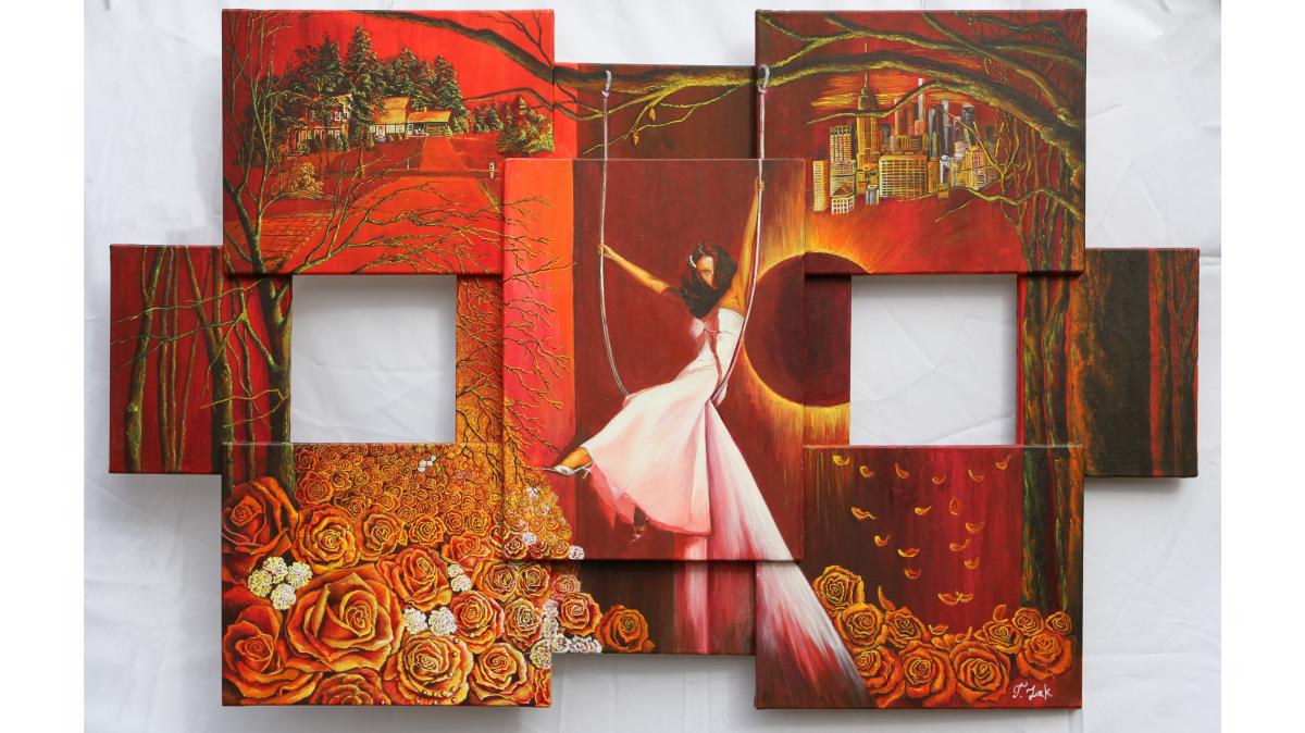
Swing of Life™- 42" x 66" Original →
This distinction affects how you experience the art. A mass-produced print feels like an object on your wall. Hand-embellished art feels like a conversation between you and the artist. The visible brushstrokes, the layered textures, the subtle variations in color, these elements create depth and presence that photographs cannot capture.
From a collector's perspective, hand-embellished limited edition pieces hold meaning that extends beyond decoration. You're acquiring something with a story, a certificate of authenticity, and genuine uniqueness. The artist's signature isn't just a mark. It's a commitment to quality and intentionality.
Tatyana Zak's hand-embellished collector editions exemplify this approach. Each piece is individually enhanced with acrylic paint by the artist, making every canvas unique. The process bridges mass production and original art, offering collectors the presence of an original without the prohibitive price of a one-of-a-kind painting. This is particularly meaningful for those seeking art that resonates emotionally but requires accessibility.

Step 5: How to Style a Gallery Wall with Cohesion and Composition
A gallery wall is a curated collection that tells a story. The best gallery walls feel intentional, not random. They balance unity with variety, creating visual interest while maintaining overall cohesion.
Start with a concept. Are you creating a monochromatic gallery wall using different tones of one color? A thematic collection around nature, travel, or abstract forms? A mixed-media arrangement combining photography, prints, and textured pieces? Your concept creates the thread that ties disparate pieces together.
Choose a grid or organic layout. Grid layouts, aligned rows and columns, feel structured and contemporary. Organic layouts, pieces at varying distances with no strict alignment, feel more artistic and bohemian. Neither is inherently better. Choose based on your space's personality and your personal preference.
Composition matters tremendously. Start with your largest piece as an anchor.
| Design Element | Purpose | Execution |
|---|---|---|
| Anchor piece | Establishes focal point | Largest work, slightly off-center |
| Negative space | Prevents visual clutter | Leave 2-4 inches between frames |
| Color unity | Creates cohesion | Use analogous colors or monochromatic palette |
| Size variation | Adds interest | Mix large, medium, and small pieces |
| Thematic connection | Tells a story | Choose subject matter that relates |
Step 6: Apply Art Placement Rules for Interior Design
Where you hang art matters as much as what you choose. Placement determines whether a piece becomes a focal point or blends into the background. Strategic placement amplifies emotional impact and visual function.
Hanging Height and Eye Level
The standard eye-level height of 57-60 inches from floor to center of artwork applies to most residential spaces. In rooms with high ceilings, you might adjust slightly upward. In rooms with low ceilings, center the piece accordingly.
Framing and Mounting Techniques
Framing does more than protect art. It frames your vision, literally and figuratively. The right frame enhances the piece. The wrong frame diminishes it. Choose frames that complement without competing. Simple frames in natural wood, matte black, or white work for most contemporary art. Ornate frames suit traditional or vintage pieces.
Common Mistakes to Avoid When Selecting Wall Art
Understanding what doesn't work helps you make better choices. These mistakes derail even well-intentioned efforts.
Frequently Asked Questions
What is the difference between mass-produced prints and hand-embellished art?
Mass-produced prints are reproduced identically thousands of times using mechanical processes, while hand-embellished art starts as a print and is individually enhanced with acrylic paint by the artist. Hand-embellished pieces like those from Tatyana Zak are unique, no two are identical. This process bridges the gap between reproduction and original artwork, adding texture, depth, and character that makes each piece feel personal and collectible rather than generic.
How do I choose meaningful wall art that actually reflects my personality?
Start by identifying emotions and themes that resonate with you personally. Ask yourself what draws you emotionally to a piece, is it the color, subject matter, or the feeling it evokes? Consider your life experiences and what messages matter to you. Meaningful art often speaks to where you are in your life journey. Rather than selecting pieces based solely on whether they match your decor, prioritize art that creates an emotional connection or invites reflection about your values and experiences.
What is the 2/3 rule for wall art placement?
The 2/3 rule is a composition guideline that suggests placing focal points and key artwork at approximately two-thirds of the way across or down a wall, rather than dead center. This creates visual interest and guides the viewer's eye naturally through the space. When hanging a single large piece or arranging a gallery wall, using this principle helps achieve better visual balance and prevents the arrangement from feeling static or overly symmetrical.
How do I know if a piece of art will feel right in my home before purchasing?
Consider the room's function, existing color palette, and the mood you want to create. Take photos of your space and imagine the artwork in context. Think about scale, does the piece proportionally fit the wall? Reflect on whether the subject matter and colors energize or calm you. If you're uncertain, choose pieces that speak to your heart rather than just your décor. Hand-embellished limited-edition pieces like those from Tatyana Zak come with the assurance of quality craftsmanship and authenticity, reducing the risk of buyer's remorse.